Better Season Results Visualizations
In the past, we’ve Having a table of expected positions looks terrible. It’s hard to read, doesn’t fit in a page, and that much data is hard to absorb on the face of it.
Luckily, R has some great visualization tools in ggplot2. I’ll demonstrate some new ways to visuallize results, based on past posts’ predictions, and I’ll use these in future posts.
Looking at the data inspired me to match the stacked probability curves used by fivethirtyeight in posts like these.
To do this, using ggplot’s facet feature, I needed to reshape the data. A simiple forloop and lapply gets me what I need:
library(reshape2)

nhl2016predictexpand<-list()

for (t in c(1:30)){
    nhl2016predictexpand[[rownames(nhl_2016_predicted_standings)[t]]]<-unlist(lapply(c(1:30), function(y) rep(y, nhl_2016_predicted_standings[t,y])))
}

df.results<-as.data.frame(t(as.data.frame(nhl2016predictexpanded)))
## Error in as.data.frame(nhl2016predictexpanded): object 'nhl2016predictexpanded' not founddf.results$Team<-rownames(df.results)
df.results.m<-melt(df.results, "Team")This expands the data from summary form we saw to a (very) long form, listing each teams’ position the number of times they placed there. Thus, this is a 30,000 (30 teams x 1000 simulations) length frame.
Data in this form allows us to use ggplot’s facet:
ggplot(df.results.m, aes(x=value)) +
    geom_density(alpha=0.3, adjust=1.5) +
    facet_grid(Team~., scales="free") +
    theme(strip.text.y = element_text(angle=0), strip.background = element_blank()) +
    scale_y_continuous(breaks=NULL) +
    xlab("End-Of-Season Position") +
    ylab("Probability") +
    ggtitle("Probability of finishing at each position in 2015")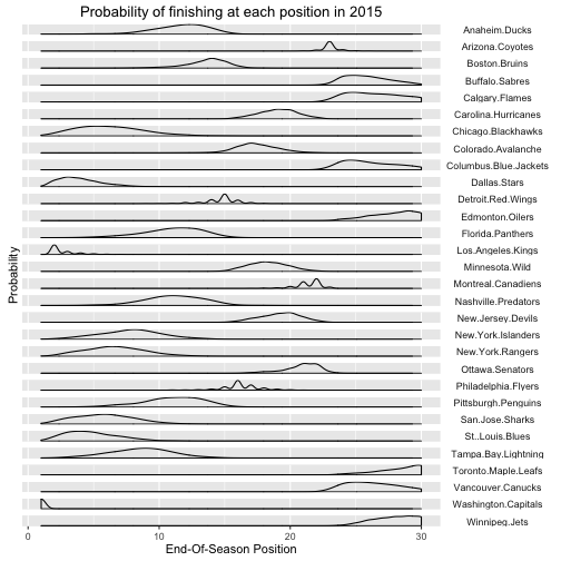
There’s obviously lots of work that can be down with these plots (for another day), but it gives a much clearer picture of who expects to finish where.