NHL and Elo Through the Years - Part 3
Having Elo ratings for teams over all time is cool, but how do we know that it’s meaningful? Sure, we can look at the Stanley Cup winning team each year, and see that they typically have a good rating. Or, we can anicdotally look back at our favourite team, remember how good or bad they were for a few seasons in the past, and see that they were near the top or the bottom of the pile at that point in time.
For example, here’s a plot of the Stanley Cup (or, at least the season championship) winning team’s rating and the average rating of the league(s) at that time. Remember, I have WHA data mixed in, you’ll notice that the Houston Aeros fit through the cracks on this quick analysis. And, because the teams history is carried through under their current name, you can see that Arizona Coyotes won the championship at one time (1976 WHA as the Winnipeg Jets). You can see that the winning team is typically ranked much better than the average, as expected.
sc_ratings<-list('year'=numeric(), 'rating'=numeric(), 'team'=character(), 'mean_rating'=numeric())
for (i in c(1918:2016)){
    sc_ratings$year<-c(sc_ratings$year, i)
    last_game<-tail(nhl_results[nhl_results$Date < as.Date(paste0(i, '-07-31')),],1)
    win_team<-""
    ifelse(last_game$Result > 0.5, win_team<-as.character(last_game$Home), win_team<-as.character(last_game$Visitor))
    sc_ratings$team <-c(sc_ratings$team, win_team)
    rating<-tail(elo_all_long[(elo_all_long$Team == make.names(win_team) & elo_all_long$Date < as.Date(paste0(i,'-07-31'))),],1)$Rating
    sc_ratings$rating<-c(sc_ratings$rating, rating)
    sc_ratings$mean_rating<-c(sc_ratings$mean_rating, tail(elo_data$Meta[elo_data$Meta$season.end < as.Date(paste0(i, '-07-31')), 'mean'],1))
}
sc_ratings<-as.data.frame(sc_ratings)

ggplot(sc_ratings, aes(x=year, y=rating)) +
     geom_point(aes(colour = factor(team))) +
     geom_point(aes(x=year, y=mean_rating), colour='grey') +
     theme_bw() + theme(legend.position='bottom') +
     guides(colour = guide_legend(title.position="top", title.hjust = 0.5)) +
     labs(color="Team") +
     xlab("Year") +
     ylab("Rating") +
     ggtitle("Rating of Championship Team vs. Year")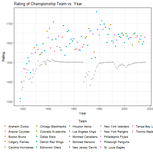
But, there should be some quantitative things we can check to make sure that a) ratings make a difference in how teams do, and b) if we use it to make predictions, that those have at least some value.
First, we’ll extract the Elo rating for each team going into a game.
eloAtGameTime<-function(game){
    h_elo<-tail(elo_long[(elo_long$Date < as.Date(game['Date']) & elo_long$Team == make.names(game['Home'])),'Rating'],1)
    v_elo<-tail(elo_long[(elo_long$Date < as.Date(game['Date']) & elo_long$Team == make.names(game['Visitor'])),'Rating'],1)
    return(c(h_elo, v_elo))
}
gameresults<-apply(nhl_data, 1, function(x) eloAtGameTime(x))
nhl_data$HomeElo<-gameresults[1,]
nhl_data$VisitorElo<-gameresults[2,]
nhl_data$EloDiff<-nhl_data$HomeElo-nhl_data$VisitorElo
Having done that (warning, this is a slow implementation, speeding it up would be very very helpful), we can try making some plots of Elo vs. different aspects of the games’ result. Let’s start with simply looking at the predictive power for each game #plot scatter of elo adv. (including home) by win proportion.
ggplot(nhl_data) +
    geom_boxplot(aes(x=as.factor(Result), y=EloDiff)) +
    geom_smooth(aes(x=Result*8, y=EloDiff), method=lm) +
    theme_bw() +
    ggtitle("Elo Ranking Difference vs. Result") +
    xlab("Result (0 = Away Win)") +
    ylab("Elo Difference (Home-Away)")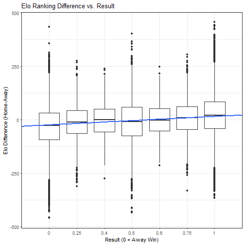
Is it predictive? Yes…. Is it strongly predictive? I’d say no. There are pleanty of examples where the better team loses, or the worse team wins. At some point there was a team that was rated over 400 points higher, and lost. Similarly, there are pleanty of examples of teams over 300 points worse and losing.
The thing is, we don’t know by what margins these teams won or lost. Maybe we can get more of that information out of a goal differential relationship.
nhl_data$GoalDiff<-nhl_data$HomeGoals-nhl_data$VisitorGoals
ggplot(nhl_data) +
    geom_boxplot(aes(x=as.factor(GoalDiff), y=EloDiff)) +
    geom_smooth(aes(x=GoalDiff+14, y=EloDiff), method=lm, colour='red') +
    geom_smooth(aes(x=GoalDiff+14, y=EloDiff)) +
    theme_bw() +
    ggtitle("Elo Difference vs. Goal Difference") +
    xlab("Goal Differential (Home - Away)") +
    ylab("Elo Difference (Home-Away)")
## `geom_smooth()` using method = 'gam'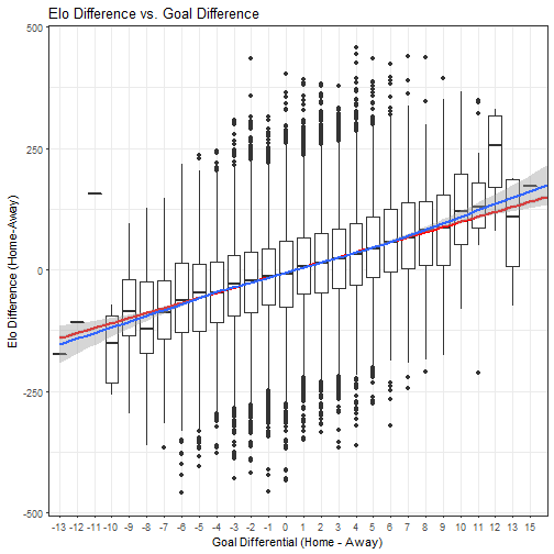
That looks much better. There are many examples of teams with better ratings losing, but they typically don’t lose by much. The inverse is true too.
We can look at the data and say, with more confidence, that there is a loose relationship between Elo rating differential and goal differential. While there’s still lots of uncertainty (as with all macro prediction schemes), there is a relationship.
For those who are curious, the equation of that line of best fit is y=10.3985427293911x-5.45446888161381.
One other thing we can do is plot proportion of wins, losses and ties by Elo Difference:
propresults<-list(EloDiff=numeric(), Win=numeric(), Draw=numeric(), Loss=numeric())

for (i in unique(round(nhl_data$EloDiff))){
    propresults$EloDiff<-c(propresults$EloDiff, i)
    x<-nhl_data[round(nhl_data$EloDiff) == i,]
    propresults$Win<-c(propresults$Win, length(x[x$Result == 1,'Result']))
    propresults$Draw<-c(propresults$Draw, length(x[(x$Result < 0.61 & x$Result > 0.39),'Result']))
    propresults$Loss<-c(propresults$Loss, length(x[x$Result == 0,'Result']))
}
propresults<-as.data.frame(propresults)

propresults<-propresults[order(propresults$EloDiff), ]
propresults$Total<-propresults$Win+propresults$Draw+propresults$Loss

propresults$nWin<-propresults$Draw+propresults$Loss
propresults$nLoss<-propresults$Draw+propresults$Win

propresults$pWin<-glm(cbind(Win, nWin)~EloDiff, data = propresults, family = binomial('logit'))$fitted
propresults$pLoss<-glm(cbind(Loss, nLoss)~EloDiff, data = propresults, family = binomial('logit'))$fitted
propresults$pDraw<-1-(propresults$pWin+propresults$pLoss)

ggplot(propresults) +
    geom_point(aes(x=EloDiff, y=Win/Total, colour='Win'), alpha=0.2)+
    geom_point(aes(x=EloDiff, y=Draw/Total, colour='Draw'), alpha=0.2)+
    geom_point(aes(x=EloDiff, y=Loss/Total, colour='Loss'), alpha=0.2)+
    geom_line(aes(x=EloDiff, y=pWin, colour='Win Fitted'))+
    geom_line(aes(x=EloDiff, y=pDraw, colour='Draw Fitted'))+
    geom_line(aes(x=EloDiff, y=pLoss, colour='Loss Fitted'))+
    theme_bw() +
    ggtitle("Elo Difference vs. Proportion of Results") +
    xlab("Elo Difference (Home-Away)") +
    ylab("Proportion of Each Result") +
    scale_colour_brewer(palette = "Dark2")
## Warning: Removed 1 rows containing missing values (geom_point).## Warning: Removed 1 rows containing missing values (geom_point).## Warning: Removed 1 rows containing missing values (geom_point).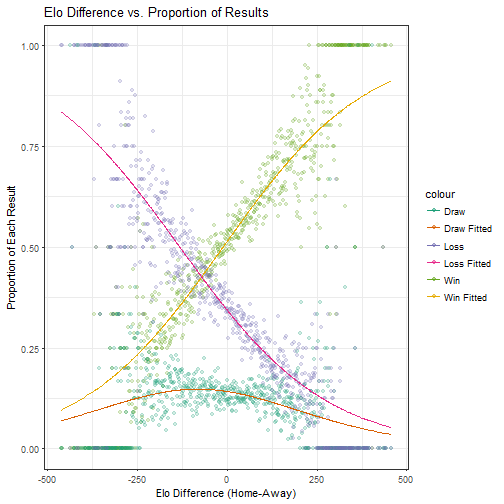
Wow! Serious correllation here. It’s important to note that Wins include overtime, but not shootout wins, similarly with losses. Shootouts and proper ties are handled as draws. We can see as well that the sum of the linear best fits is quite close to one (about 0.95) and has only a very slight slope (approximately 10e-5), as we would expect for corellations of all data.