NHL Data Preparation
Note: This is earlier work I did (last winter/spring) so some info may seem dated at time of posting. I’ve used data files current to then.
Much work has been done on predicting winners of sports or games. Many different tools exist, including some that attempt to predict the score of games. Some are specific to a sport, such as the WASP tool for cricket, while others are simple and useful everywhere, like the log5 technique. Some use advanced individual statistics to sum up probabilities (see this pdf), and others use various statistical tools, such as Bayesian analysis.
Recently, I’ve seen Poisson regression, and in particular work by Dixon and Coles in 1997 applied to English Premier league results. This technique is based on predicting the number of goals each team scores independently, and thus calculating the Poisson distribution, which gives us the probability that it happens any number of times. We predict the scores by analyzing historical data, calculating each team’s attack and defence ability. We also add in a ‘home’ advantage, because teams do better at home where the facility is familiar and the crowd is (usually) friendly.
Dixon and Coles modified the simple Poisson probability tables by improving predictions for low scoring games, and by adding an ‘aging’ factor to reduce the importance of old data relative to recent data. Last year’s score isn’t as informative as the scores from the last month.
One can find this applied to soccer and other sports with a quick google search. In particular, I like the work of Jonas at opisthokonta.com. However, application of this work to hockey is less widely available. I’ll show an implementation of Dixon-Coles for NHL scores, and use the predicted values to simulate the remainder of the season, showing who has the best chances of winning the President’s Trophy and of taking home the Stanley Cup.
We’ll start by getting historical stats from Hockey-Reference.com. You can see earlier blog posts about getting that data. We’ll start from reading in the data from the .csv file for the 2014-2015 season, and taking a quick look at it.
nhl2015 <- read.csv("./_data/20142015.csv")
head(nhl2015)
## X Date Visitor G Home G.1 X.1 Att.
## 1 1 2014-10-08 Philadelphia Flyers 1 Boston Bruins 2 NA
## 2 2 2014-10-08 Vancouver Canucks 4 Calgary Flames 2 NA
## 3 3 2014-10-08 San Jose Sharks 4 Los Angeles Kings 0 NA
## 4 4 2014-10-08 Montreal Canadiens 4 Toronto Maple Leafs 3 NA
## 5 5 2014-10-09 Winnipeg Jets 6 Arizona Coyotes 2 NA
## 6 6 2014-10-09 Columbus Blue Jackets 3 Buffalo Sabres 1 NA
## LOG Notes
## 1 NA NA
## 2 NA NA
## 3 NA NA
## 4 NA NA
## 5 NA NA
## 6 NA NAThere’s a few things to note. There’s a few extra columns that don’t matter, like Notes, Notes.1, etc. In fact, we only need a few columns, so we’ll drop the rest. Some seasons have games postponed, those games have no data, and will mess up our results, so we’ll cancel those too. Finally, names like G and G.1 aren’t useful, so lets fix those.
nhl2015 <- nhl2015[2:7]
nhl2015 <- nhl2015[!is.na(nhl2015$G), ]
colnames(nhl2015) <- c("Date", "AwayTeam", "AG", "HomeTeam", "HG", "OT.SO")
Now, lets take a look at the data in some more detail.
percent_ot_so <- as.numeric((table(nhl2015$OT.SO)[2] + table(nhl2015$OT.SO)[3])/nrow(nhl2015))
percent_ot_so
## [1] 0.2487805So we see that we have 0.2487805 percent of our games go to overtime or shootout in the 2014-2015 season. We caon do more interesting things, like show the goal distributions for home, away, and the ‘win by’ (or goal difference). We’ll use ggplot2 for nicer looking graphics than what’s available in base R, and the cowplot.
library(ggplot2)
library(cowplot)
## Error in library(cowplot): there is no package called 'cowplot'plot_AG <- ggplot(nhl2015, aes(AG)) + ggtitle("Away Goals") + xlab("Goals") +
scale_x_continuous(breaks = seq(0, 10, 2)) + geom_bar(width = 0.8)
plot_HG <- ggplot(nhl2015, aes(HG)) + ggtitle("Home Goals") + xlab("Goals") +
scale_x_continuous(breaks = seq(0, 10, 2)) + geom_bar(width = 0.8)
plot_diff <- ggplot(nhl2015, aes(AG - HG)) + ggtitle("Goal Difference (+ve is Away Win)") +
xlab("Goals") + scale_x_continuous(breaks = seq(-8, 8, 2)) + geom_bar(width = 0.8)
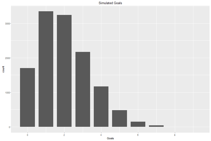
plot_grid(plot_AG, plot_HG, plot_diff, align = "h", nrow = 1, ncol = 3)## Error in eval(expr, envir, enclos): could not find function "plot_grid"Both home and away goals look Poisson! Here’s what a Poisson curve looks for a similar set of random numbers with the same characteristics:
One thing to note with the goal difference plot is the lack of 0 goal difference (no ties have been allowed since 2005-2006 season), and the associated increase in goal differences of 1. Recall that the odds of a game ending in OT or SO is 0.2487805. When modelling games, you want to be able to see ties, because OT and SO games are allotted an extra point, and are included in tiebreaker stats.
So, one technique would be to score the OT/SO games as tied, then track who wins them, and how. The following functions will set us up for that. Both take a row as the input, and can be ‘vectorized’ by calling apply on them.
otTagger <- function(row) {
    if (row["OT.SO"] != "") {
        if (row["AG"] > row["HG"]) {
            return("A")
        } else {
            return("H")
        }
    } else {
        return("")
    }
}

otFixer <- function(row) {
    H <- as.integer(row["HG"])
    A <- as.integer(row["AG"])
    if (row["OT.Win"] == "H") {
        H <- H - 1
    } else if (row["OT.Win"] == "A") {
        A <- A - 1
    }
    return(data.frame(HG = H, AG = A))
}

nhl2015$OT.Win <- apply(nhl2015, 1, otTagger)
scores <- do.call("rbind", apply(nhl2015, 1, otFixer))
nhl2015$AG <- scores$AG
nhl2015$HG <- scores$HG
nhl2015$Date <- as.Date(nhl2015$Date)
Now that we have the goals stored as they were at the end of regular time, lets look at the goal difference distribution again:
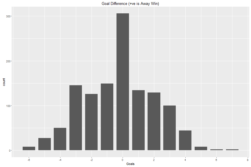
That looks better, but the effect of tied games overrides the normal distribution. Maybe this is just a season effect? We can import past seasons as well, and look at thousands more games to find out what’s removed by adding more data points.
First, lets’ make a function to handle the whole import and cleaning set. This just does what we did above:
nhlDataPrep <- function(df) {
    colnames(df) <- c("Date", "AwayTeam", "AG", "HomeTeam", "HG", "OT.SO")
    df <- df[!is.na(df$AG), ]
    df$OT.Win <- apply(df, 1, otTagger)
    scores <- do.call("rbind", apply(df, 1, otFixer))
    df$AG <- scores$AG
    df$HG <- scores$HG
    df$Date <- as.Date(df$Date)
    return(df)
}
I’ll pull from the 2005-2006 season forward, when they started the shootout until today.Again starting from downloaded csv files, we’ll import each, and add them to one large dataframe Now remember, in the last few years some teams have moved or changed names. The Phoenix Coyotes are now the Arizona Coyotes. The Mighty Ducks of Anaheim are now the Anaheim Ducks. The Atlanta Thrashers moved to Winnipeg and became the Jets.
getAndPrepAllData <- function(year_list = c(2006, 2007, 2008, 2009, 2010, 2011,
    2012, 2013, 2014, 2015, 2016)) {
    df <- data.frame(Date = NULL, Visitor = NULL, G = NULL, Home = NULL, G.1 = NULL,
        X.1 = NULL)
    for (year in 1:length(year_list)) {
        df <- rbind(df, read.csv(paste("./_data/", year_list[year] - 1, year_list[year],
            ".csv", sep = ""))[2:7])
    }
    df[df$Home == "Phoenix Coyotes", ]$Home <- "Arizona Coyotes"
    df[df$Visitor == "Phoenix Coyotes", ]$Visitor <- "Arizona Coyotes"
    df[df$Home == "Mighty Ducks of Anaheim", ]$Home <- "Anaheim Ducks"
    df[df$Visitor == "Mighty Ducks of Anaheim", ]$Visitor <- "Anaheim Ducks"
    df[df$Home == "Atlanta Thrashers", ]$Home <- "Winnipeg Jets"
    df[df$Visitor == "Atlanta Thrashers", ]$Visitor <- "Winnipeg Jets"
    df <- droplevels(df)
    df <- nhlDataPrep(df)
    return(df)
}

all_nhl <- getAndPrepAllData()
Let’s look at that data:
str(all_nhl)## 'data.frame': 12865 obs. of 7 variables:
## $ Date : Date, format: "2005-10-05" "2005-10-05" ...
## $ AwayTeam: Factor w/ 30 levels "Boston Bruins",..: 14 17 28 12 23 6 29 3 21 22 ...
## $ AG : num 2 4 5 4 1 3 0 3 1 2 ...
## $ HomeTeam: Factor w/ 30 levels "Boston Bruins",..: 1 2 5 8 9 10 11 13 16 15 ...
## $ HG : num 1 6 3 5 5 4 2 6 5 3 ...
## $ OT.SO : Factor w/ 3 levels "","OT","SO": 1 1 1 1 1 1 1 1 1 1 ...
## $ OT.Win : chr "" "" "" "" ...And the goals chart (again):
## Error in eval(expr, envir, enclos): could not find function "plot_grid"Next time we’ll start actually modelling goals scored with Dixon-Coles.